Going Beyond Native Platform Standards
| By Inspire Visual Updated January 2025 |
The average person spends almost 4 ½ hours daily on their mobile phone. Before the era of smartphones, that was unheard of, but with the introduction of smartphones and apps, suddenly, there’s a reason to use the phone for everything, whether it’s social media, games, or solving daily tasks.
Behind every successful app, there is a carefully crafted app user interface. You may not give it much thought when you use an app, but creating an intuitive and appealing user interface takes a long time and requires a lot of revisions before getting that final design nailed down. Using the right mobile app developers that offer exactly what you want is crucial.
The differences between iOS and Android user interface design
If you are designing for native app development, you only need to adhere to platform-specific development guidelines. Whereas, if you are designing for cross-platform apps, you need to make sure your app use design principles compatible with users of both iOS and Android devices.
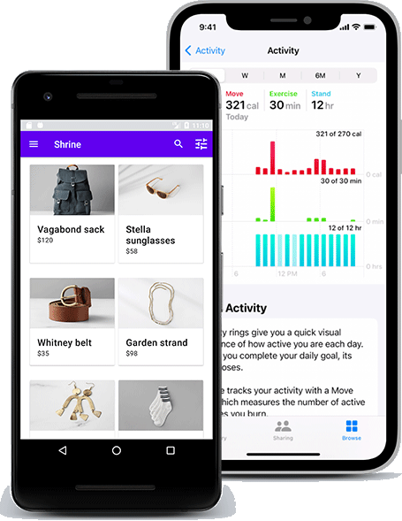
The differences between iOS and Android UIs are less than they once were. Initially, iOS focused on a 3D style with beveled buttons, taskbars, and icons. On the other hand, Android was a more “functional” (but not pretty) interface mimicking its desktop big brother Windows.
Apple and Google have precise guidelines for how to design for each respective platform. As the name implies, they are just guidelines, but studying them in detail is wise. They are the cornerstone for every successful app design. They introduce familiarity to the entire user interaction journey but with the freedom to add your mark to your app design.
The two interfaces have merged into a similar style, and with the introduction of cross-platform apps, they quickly started looking much more alike. You should be aware of functional differences, but a great app design is also about making it work on both platforms while keeping it familiar to the user. We’ll explain that in more detail below.
Apple Human Guidelines explained
UI resources and information on Apple’s devices are provided in Apple’s Human Interface Guidelines (HIG). There is a lot of information designers should use and pointers to design intuitive and better app interfaces.
Apple has organized the HIG into categories for each of its device platforms. macOS, iOS, watchOS, and tvOS are all separated, allowing you to read about specific platforms you will be developing for instead of being overwhelmed all at once.
Once you choose a platform, you can further go into the specific topic that interests you. For example, UI controls, app architecture, views, or controls.
When you receive the wireframes, you need to start organizing each element on the screen. The HIG is an excellent resource for reviewing recommendations and learning about why the basic styling should be placed in specific locations on the interface. For example, on iOS, it’s common to have the “previous screen” button in the top left corner.
You’ll also learn about margins, safe areas, and other essential details to ensure your app will present its best and no content will be illegible.
Every iOS release introduces new features to stay competitive in the market. Chances are you might want to take advantage of the new features, and the HIG will explain how you can use them and where you should include them in your app.
Android Material Design explained
While the first release of the Android 1.0 operating system was in 2008, it wasn’t until 2014 that Google’s Material Design was defined and introduced to the public.
The material design originated from the “Google Now” app and used a grid-based layout with effects to show depth, such as shadows behind elements.
Google’s design language is based on real-life items like ink and paper, so everything is very minimalistic, with a few colors assigned to specific functions, e.g., a blue button, a red navigation bar, and blue toggles.
Material Design has evolved into Material Design 2, emphasizing rounded corners, white space, and colorful icon treatments. There is still a strong preference for having a flat user interface design.
In Google’s Material Design manual, you can learn about Design, Components, and Development, each divided into categories with much helpful information for each type. For example, if you want to know about how floating action buttons work, head into Components > Buttons: floating action button, and you’ll get a page full of interactive examples, descriptions of behavior, specifications, and a lot more.
The main differences Designing for iOS and Android
Being two different design manuals, there will, of course, be many differences, but don’t despair. Besides the major differences, you don’t need to worry about them too much. Especially if you are developing a cross-platform app, you will want to design for a middle ground between the two.
These are the main differences between iOS and Android
| Element | iOS | Android |
| Primary app navigation | Bottom location | Tabs at the top location |
| Secondary app navigation | Bottom location / more icon | Hamburger menu button |
| Clickable button size (min) | 44×44 pt | 48×48 dp |
| Primary button | On-page UI | Top nav, right |
| Single-choice list | Picker scroll-wheel | Radio buttons |
| Multiple-choice list | List with checkmarks | List with switches |
These are the functional items you need to consider how to mesh if you are working on a cross-platform app.
Less essential differences are the titles placement, iOS titles are usually centered and Android titles are left-aligned, and the look of each element on the screen. This part is where you have some visual freedom to put your personal touch or your company’s branding.
Make one user interface design that works for both iOS and Android
Think of designing apps for a smartphone, tablet, smartwatch, or whichever devices you are targeting instead of thinking of it as an iOS vs. Android task.
Let’s say you are designing an interface for a smartphone. What do we know about that device?
Well, most people hold it upright in portrait mode. The screen is relatively small compared to a tablet, laptop, or desktop.
The most used functionality, the primary app navigation, should be placed at the bottom close to the user’s thumb and pointer finger for easy access.
And the buttons should be finger sized and reasonably spaced out, so there’s no risk of clicking the wrong item.
That’s the starting point with no differentiation between the devices because, after all, they function almost the same way.
Most large and popular apps are available for Android and iOS. No doubt, the big app development agencies paid attention to the Human Interface Guidelines and Material Design book. Still, they also figured out how to make them work in unison, and that’s the secret to a great app design.
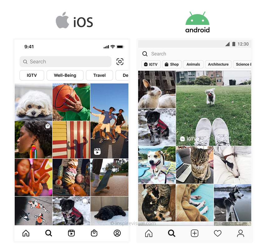
Look at the example from Instagram above. They play off the subtle differences between iOS and Android while making it an almost identical experience for iOS and Android users.
Why use the same design for iOS and Android platforms?
The perhaps most important reason, at least for the payee, is the cost-savings of only maintaining one interface for two platforms.
It makes it a lot easier when the changes you are doing don’t have to meet guidelines from two different companies who might have completely different “solutions” to a new feature you are introducing.
There is less room for error, and progressively diverse interfaces as new features are introduced, and older ones removed.
You guarantee a consistent experience to your users if they switch devices, thereby increasing satisfaction and retention parameters.
Should I ever design for a native iOS or Android app?
If you are sure your app will only be used on one platform, or if you have a minimal design budget, it would make sense to adhere strictly to either iOS or Android design guidelines.
You will not have to compromise on any design element, gesture, or interaction, and it does make it easier and faster when you don’t have to consider the other platform.
What user interface programs are available?
If you’re eager to start, consider one of the many design tools available today. There’s plenty to choose from in all price ranges with each their pros and cons. We list the three best below.
Common for all is that they can offer all the tools you need to design a beautiful interface. Many provide templates to ensure you conform to the platform guidelines and best practices and even drag and drop elements, so you can build the shell of your interface quickly and then add flair afterward.
Initially, the go-to program used to be Adobe Photoshop, and it’s still a favorite choice among many designers. Since it’s not strictly a mobile app design program, it lacks many features our top three picks below have, such as dragging and dropping UI elements, export functionality, and more.
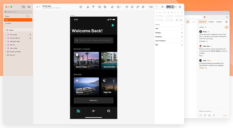
The design tool of choice for many and introduced back in 2010. When Sketch was released, it was a game changer in the interface design world. Since then, a wealth of similar tools has been developed, with few still able to compete.
It’s only available as a desktop app for Mac, so Windows users will have to look at our other two top choices. There’s also a web app available, but it’s limited to only viewing projects, designs, and assets and leaving comments.
With Sketch, you can get instant design previews on your mobile device. Very convenient to check if something works on the smaller mobile screen. They also offer a mind-boggling extensive plug-ins library with over 1000 options, so whatever you need is probably available as a plug-in.
The program is lightweight and runs snappy unless you have a complex app with more than 100 artboards (screens), which would affect responsiveness.
It has a quick learning curve, so it’s easy to pick up for a beginner. The default libraries for Apple’s Human Interface Guidelines and Google’s Material Design allow you to drag and drop UI elements into your design.
A downside is that Sketch is a subscription model, like every software seems to be nowadays, so you’ll have to continuously shell out money to use it and to receive updates.
Figma
Trial: No free trial available
Price: Free (starter), $15/month or $144/annual (professional) and $540/annual (organization)
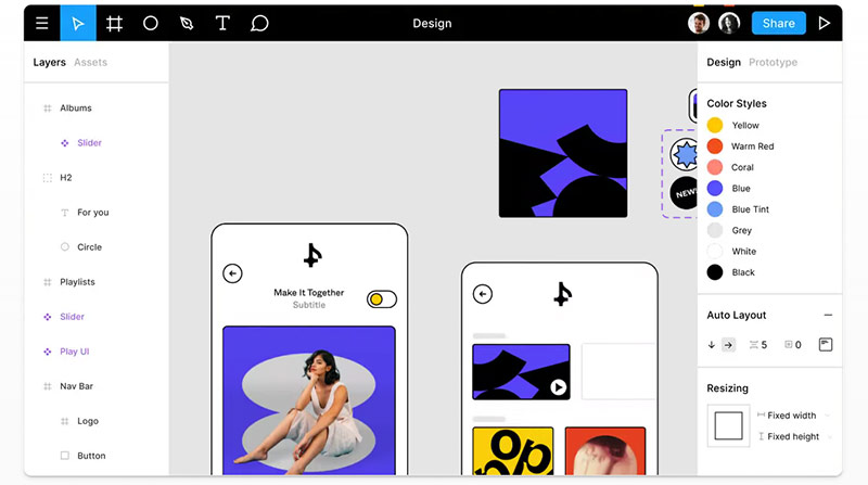
Figma quickly became a strong contender to Sketch when it hit the market in 2016. While it’s primarily a web-based tool, it’s also available for desktop use on Mac and Windows.
A companion app for iOS and Android allows instant previews on any iOS or Android mobile device.
Figma offers a solid real-time collaboration functionality. That means multiple team members can work on the same project simultaneously. Whether in-house or remote teams, it’s a streamlined process with each team member able to see what is currently in development.
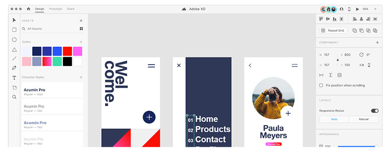
In response to the rising popularity of Sketch and people abandoning Photoshop for a better app design tool, Adobe XD was released in 2017. It’s available on Mac and Windows desktops and cannot be used in a web browser like Sketch (limited functionality) and Figma.
It had a slow start but has since picked up the pace significantly and is now on par with Sketch and Figma.
For Adobe users, it’s a massive advantage that Adobe XD can be included in an existing subscription to save on cost. It also integrates very well with the rest of Adobe Creative Suite and takes advantage of Creative Cloud’s sharing feature.
App prototypes are relatively straightforward to set up, and transition effects are applied without breaking a sweat.
The option to create interactive prototypes for troubleshooting design issues before development takes place helps avoid any redevelopment.
It has an excellent animation and prototyping preview option for presenting app designs to teams or clients, making it easier and faster to demonstrate how a button works or a screen changes.
Conclusion
The platform you will design for will dictate your design to some degree, but as we mentioned, most of the artistic freedom is in your hands.
There are some powerful design tools out there, and with free starter options for the three best options, you only need to decide which one to try and get started.
Play around and have fun. Hopefully, we’ll see your app design following these guidelines in an upcoming app before long.
And don’t forget. If you need help developing an app, whether for Android or iOS, Inspire Visual has extensive experience developing for both platforms. We build apps for mobile, tablet, smartwatches, and more. Let’s talk about it at hello@inspirevisual.com or 407.434.9171.

About Inspire Visual
At Inspire Visual, we believe that compelling design, functionality and content help drive effective results. That’s why we work hard to provide innovative, visually inspiring and functionally sound solutions to address your marketing challenges and extend your brand’s reach.
We offer decades of experience helping brands worldwide with websites, mobile app development, email marketing, direct mail campaigns, brand identity design, UI/UX, graphic design, print design, tradeshow design and more. We feel privileged to be allowed into our clients’ businesses, and we strive to provide personal service and close collaboration throughout your project.
Call 407.434.9171 or email hello@inspirevisual.com to contact us, so we can meet you, learn more about your business and answer any questions you have. We’d love to connect with you!
YOU MAY ALSO LIKE
Revolutionizing User Experiences: AI-Powered Mobile Apps
Artificial Intelligence (AI) is impacting how we interact with technology on a daily basis. Find out which five AI apps are the most powerful today and how they can help improve your life.
Navigating Tomorrow: Upcoming Trends for Mobile Apps
In 2024, mobile apps are poised to undergo a transformative evolution with several key trends shaping the landscape. Get first-hand knowledge of what is to come and what to include in your app.
Are you ready to talk about your project?

Hello, I’m Angela, co-founder of Inspire Visual! Let’s have a chat about your project. Send an email or fill out the form to get started. Talk soon!

